Hi boop!
Hi boop! is a mental health technology startup, based out of Victoria, B.C. in Canada. They are revolutionizing the way mental health assessments are done. Traditionally, assessments would be paper-based, taking doctors who are short on time, hours to reach a diagnosis. Hi boop! wanted to shorten the average 11 years down to weeks. Through a digital application and smart algorithms, their solution provides clinical insights that allows doctors to go from insight to care, quicker than ever.
scope of work
Competitive research & positioning
Brand strategy
Identity & brand design
Brand guidelines
BRAND POSITIONING
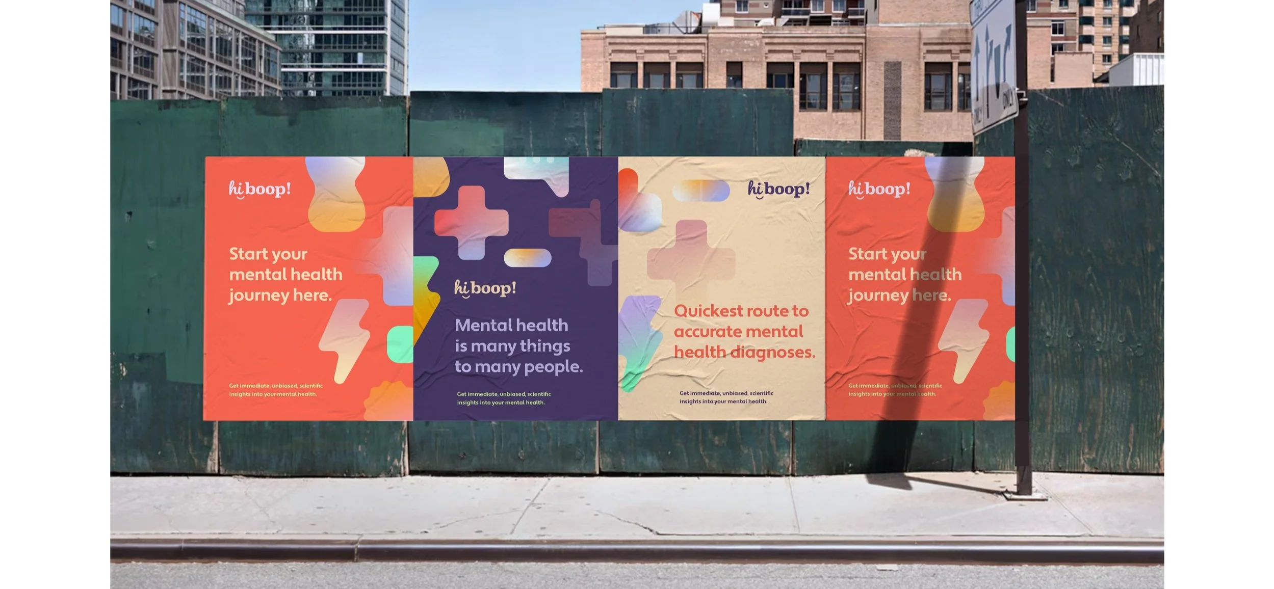
In a market filled with mental health startups, Hi boop! wanted to be approachable, friendly, and far from clinical.
IDENTITY
The identity plays on the human aspect of the ‘hi’, an informal greeting that immediately puts someone at ease. In contrast, the strong, structural nature of ‘boop’ brings in stability, trust and a seriousness associated with mental health issues.
The ‘hi’ snugly fits in an icon format, giving way to a recognizable app or display icon. The modular nature allows the identity to fit into various lockups.

Primary identity

Secondary identity lockups

SOCIAL

BRAND BUILDING BLOCKS

Brand graphics


Photography style


Website application example

Applying the brand to product UI